off the page
branding 2025
skills + tools
adobe indesign + adobe photoshop + adobe illustrator + hand-stitch embroidery
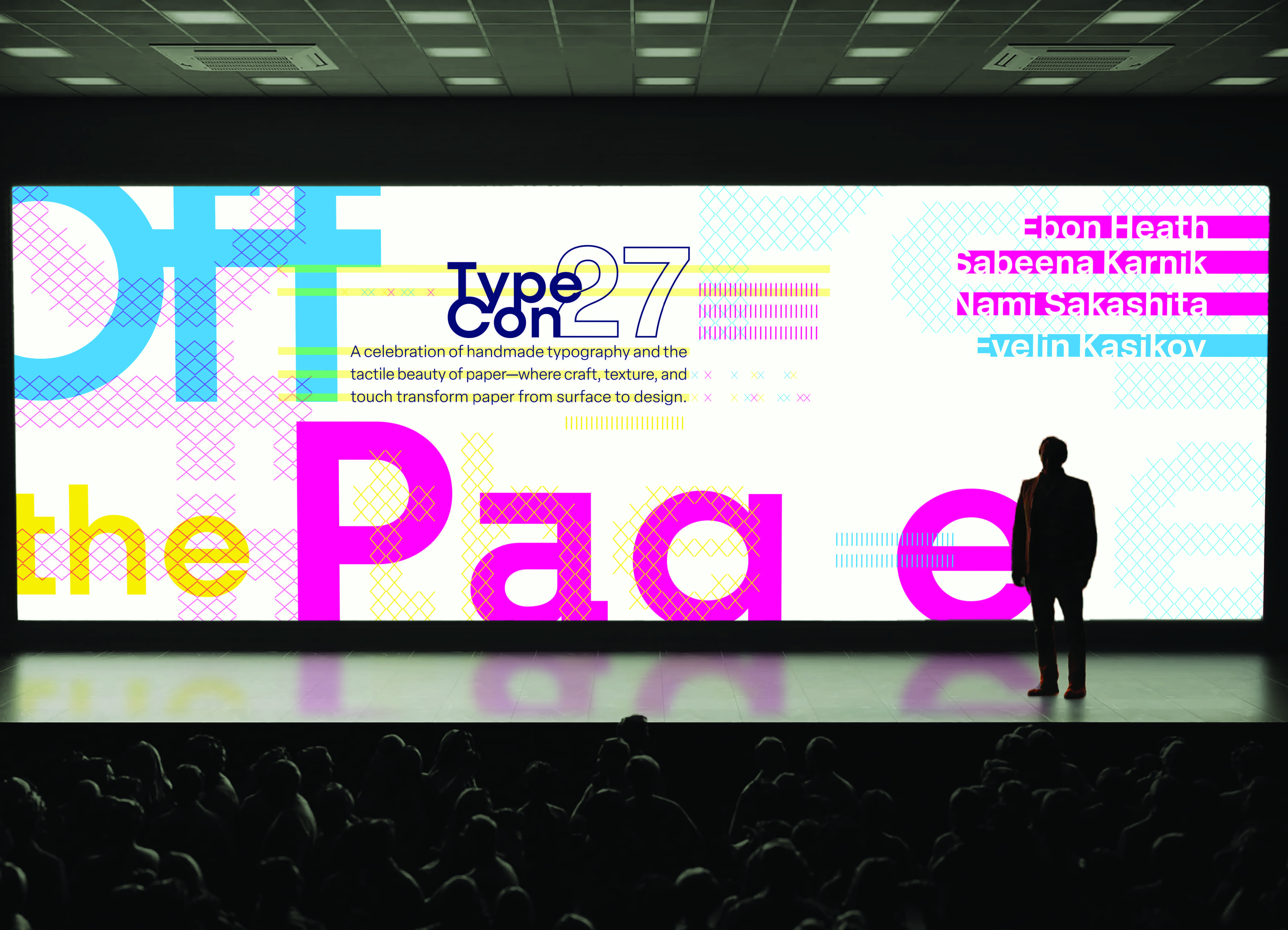
Off the Page: TypeCon 2027 explores the intersection of analog craft and digital typography through tactile paper-inspired design, celebrating type as both a visual and physical experience.

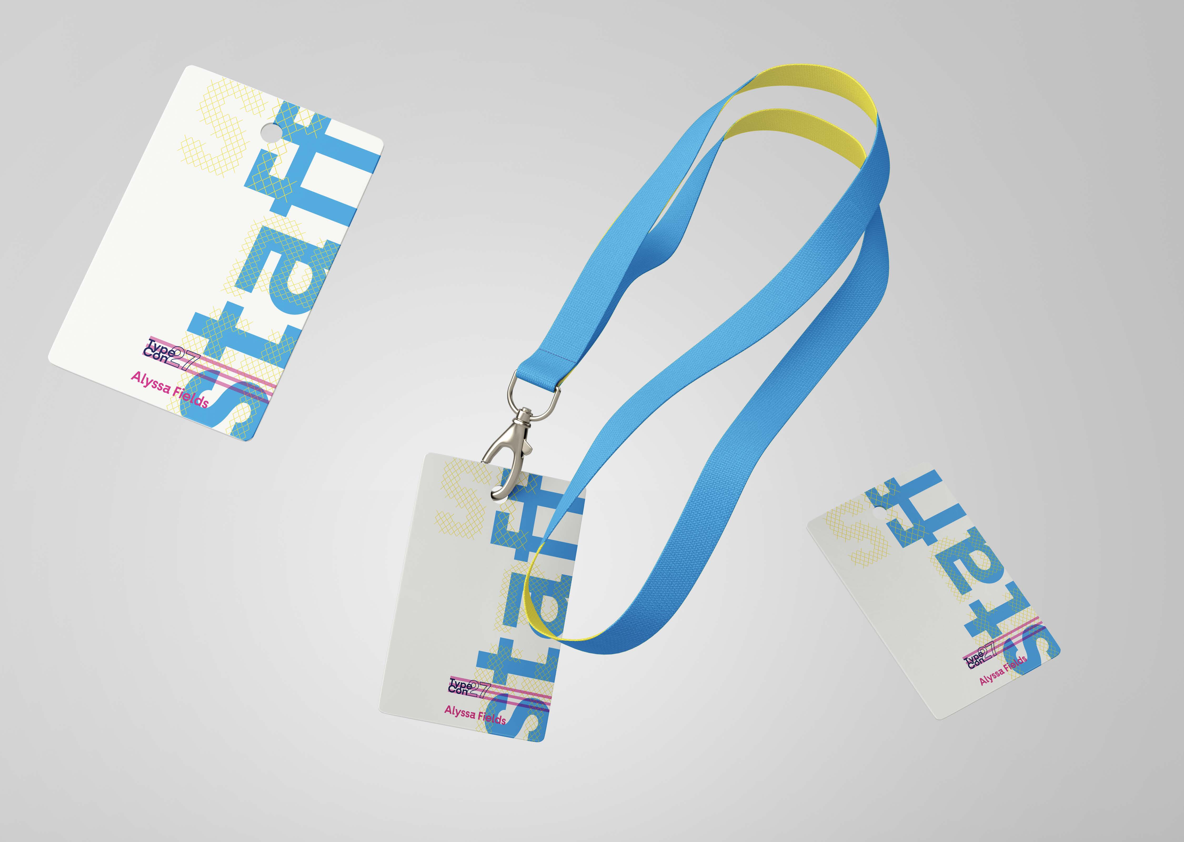
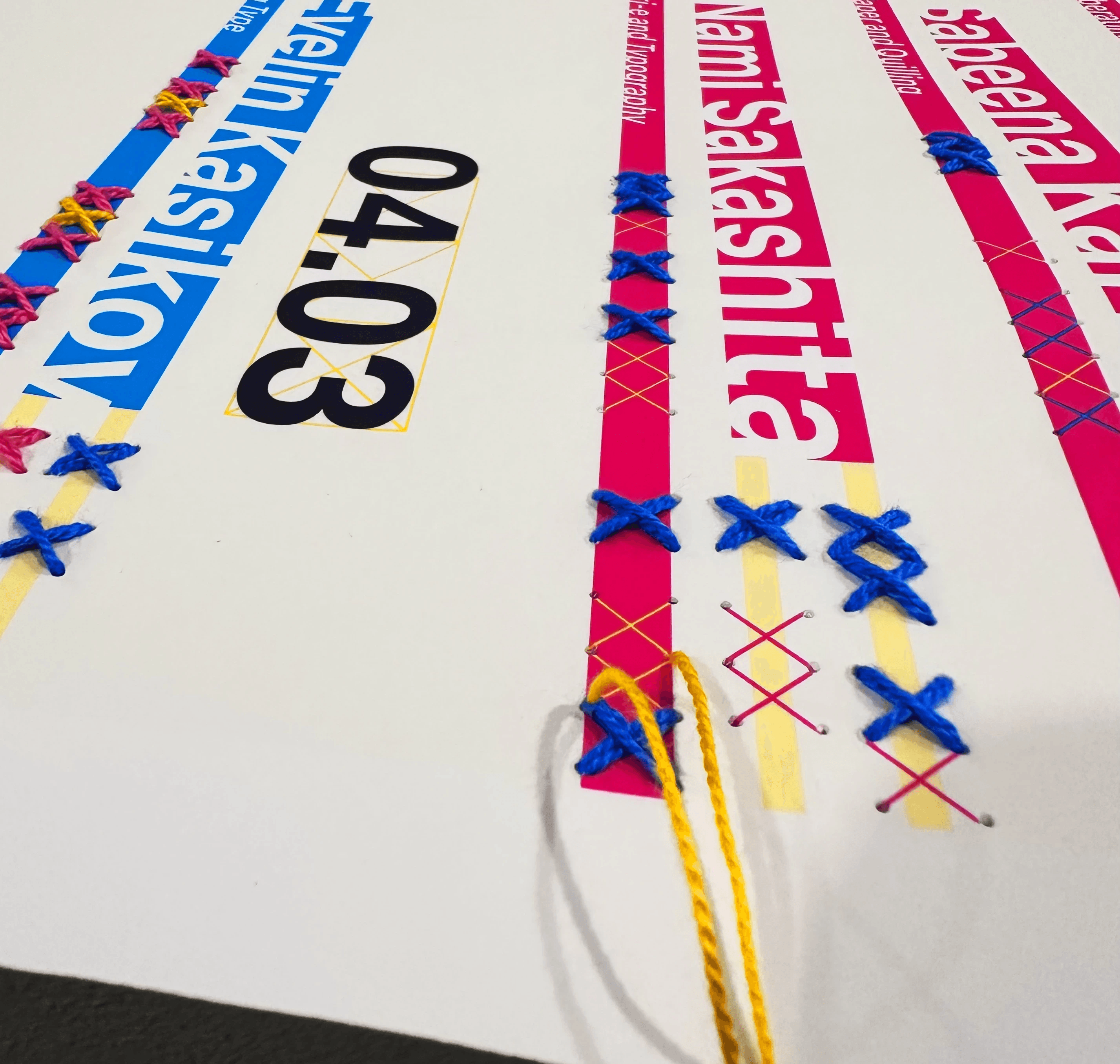
Off the Page: TypeCon 2027 celebrates typography as both a visual language and a physical experience. Inspired by the connection between analog craft and digital precision, I combined clean contemporary type with paper textures, layered forms, and handmade references. Through hierarchy, scale, and structured layouts, the typography remains clear and modern, while tactile elements like folds, cut edges, and stitching honor traditional processes. The identity creates a dialogue between past and present, showing type as something, we not only read, but also feel and experience. My hand embroidery stitching explores the relationship between typography, texture, and process by transforming digital letterforms into tactile, handmade compositions. The thread adds depth, texture, and imperfection, allowing the typography to move beyond the screen and exist as a physical object. Through hand craf, the stitched forms highlight the labor and materiality behind communication, blending analog techniques with contemporary graphic design. The branding for Off the Page extends across every part of the conference experience, creating a cohesive visual identity that connects print, physical space, and digital media. Inspired by handmade typography and paper craft, the system combines structured typography with tactile textures, layered compositions, and material-inspired details. This identity is carried throughout the convention through merchandise, lanyards, badges, signage, and screens. By translating the branding across multiple formats, the convention becomes an immersive experience where typography is not only seen, but physically felt and interacted with throughout the event.